
The missing 30%: how LIC returns are being understated — and why it matters


Recently, Firstlinks published an article comparing the performance of LICs and ETFs. It concluded that LICs have generally underperformed their ETF peers over a range of timeframes.
That may be true in some cases.
But before we draw that conclusion, there is a more fundamental question that needs to be addressed: Are we measuring these vehicles properly in the first place?
Because if we are not comparing like with like, the conclusions that follow will be unreliable — and potentially misleading for investors.
More importantly, they may be obscuring something else entirely:
That some LICs are not underperforming at all — they are outperforming, and the data simply isn’t showing it.
The problem: an incomplete comparison
There is no shortage of data comparing LICs and ETFs.
But much of it shares a common flaw.
Franking credits — a core component of LIC returns — are often excluded.
That might sound like a small technical detail. It is not.
Franking credits are a real economic benefit to investors. Excluding them is equivalent to leaving part of the return out of the equation.
The missing $3
Let’s take a simple example (which you can also view in this explainer video).
Assume two vehicles generate a 10% return from the same portfolio:
The ETF distributes the full 10% to investors
The LIC pays 30% tax, distributes 7%, and attaches 3% in franking credits
Yet many comparison tables present this as:
ETF: 10%
LIC: 7%
Conclusion: the LIC has underperformed.
But where did the other 3% go?
It hasn’t disappeared. It has been paid to the ATO on behalf of the investor and returned as a tax credit with real value.
Comparing 10% to 7% in this context is not a like-for-like comparison. It is simply an incomplete one.
“Industry standard” — but not investor standard
It is often argued that this approach is standard practice.
That occasionally may be true when assessing manager performance before tax.
But that is not how these comparisons are being used. They are being used to answer a much broader question: Which investment is better for investors?
For Australian investors, that is inherently an after-tax question.
And any framework that excludes a material part of after-tax return will lead to distorted conclusions.
Why this matters
This is not just an academic debate.
The steady narrative that ETFs outperform LICs — often based on incomplete data — is influencing investor behaviour.
Over time, that shapes:
Capital flows
Product demand
The future of the Listed Investment Company (LIC aka LIV) sector itself
If we measure things incorrectly, we will allocate capital incorrectly.
A call to action — and progress already underway
If the LIC sector wants to compete on a level playing field, it cannot rely on others to present its data accurately.
It needs to take ownership of how returns are measured and communicated.
Encouragingly, this is not starting from scratch.
Industry bodies such as LISTED are already working to improve transparency and consistency in how LIC performance is reported. That includes a focus on clearer, more comparable return metrics that better reflect what investors actually receive.
This is an important step forward. But it needs to go further.
At a minimum, the LIC industry must move toward publishing an Adjusted NTA Return Series which includes:
Dividends
Franking credits
Capital management initiatives
Because if the data is not clearly available, others will fill the gap — and they may not do it properly.
And if we want investors to make better decisions, we need to give them better tools.
LISTED has the platform to lead this. Now is the moment for the sector to align behind a clear and consistent standard for reporting LIC returns.
What proper measurement looks like: GVF — a real-world example*
So far, the issue has been about incomplete measurement — specifically, the exclusion of franking credits.
That is just one example of how comparisons can become distorted. It is not the only one — but it is a significant one.
Even if we move beyond it, another limitation remains: Many comparisons focus only on returns, and ignore the risk taken to achieve them.
To understand performance properly, we need to consider both.
Below is a table showing the annualised returns, volatility and corresponding Sharpe Ratios for a range of popular Australian investments — many of which were referenced in the original Firstlinks article.
The original analysis focused primarily on returns. But returns are only half the investment equation.
The other half is the risk taken to achieve those returns.
Risk is most commonly measured using volatility. While it is sometimes suggested that retail investors do not understand volatility, that feels overstated. At a basic level, the concept is intuitive: The more volatile an investment, the more uncertain — and therefore riskier — the outcome.
No single metric perfectly captures risk. But measures such as the Sharpe ratio or Sortino Ratio provides a useful way to assess the quality of returns, not just the magnitude.
Put simply: Higher Sharpe ratios indicate better returns for the level of risk taken.
The last 11+ years** of popular Australian investments:
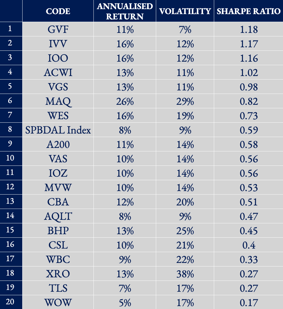
Source: Author analysis. Please see this link for all downloadable data and source references.
Note: Sharpe Ratio measures return per unit of risk (volatility). Higher values indicate more efficient, higher-quality returns.
What stands out is that GVF ranks at the top on a risk-adjusted basis.
It is worth noting that GVF is used here for a practical reason: it is one of the few LICs where we can confidently present a fully adjusted and internally consistent data set. The broader point is not about GVF specifically — it is about what becomes visible when returns are measured properly.
GVF is not a large, heavily marketed vehicle dominating flows or headlines. GVF is, by any measure, a relatively small and under-recognised LIC — and yet it is delivering the highest quality of returns in this comparison.
This is not because it generated the highest raw return. It is because it delivered the strongest, most consistent returns with lower volatility relative to those returns.
If a relatively small LIC like GVF can outperform many of the most widely held investments in Australia — when measured properly — it raises a much bigger question: How many other LICs are quietly delivering similar outcomes, but are being overlooked because the data is being presented incorrectly?
GVF is not an anomaly. It is simply a visible example of what happens when performance is measured on a complete, like-for-like basis.
Because for investors, the objective is not just to maximise returns — it is to maximise returns per unit of risk.
The bottom line
Franking credits are not a footnote.
They are part of the return.
Until they are treated that way, investors will continue to be presented with an incomplete picture.
If we want better investment decisions, we need better data.
And if we want better data, the LIC sector — led by initiatives like LISTED — needs to lead the charge.
—
* GVF is included as the LIC example in this analysis because we can ensure the completeness and consistency of the underlying data. The broader argument is not specific to GVF, and similar analysis across other LICs would be expected to produce more representative comparisons where equivalent data is available.
GVF’s investment strategy is built around identifying and investing in discounted listed investment vehicles (closed-end funds) globally and actively working to realise that value. Half the investment team responsible for this strategy are based in London — widely regarded as the global centre for closed-end funds — and has extensive experience analysing these structures across different markets, regulatory regimes and corporate governance frameworks.
That background informs how returns are measured and presented here, with a focus on consistency, comparability and accurately reflecting investor outcomes. This approach has also been reviewed and agreed by the GVF Board, which includes experienced industry participants such as Chris Cuffe, Geoff Wilson and Jonathan Trollip.
A full breakdown of the data, methodology and sources used in this analysis is available here.
** The period covers GVF’s investment life as the authors preference, this being 1 July 2014 – 31 Jan 2026. The author has also looked at 1, 3, 5, 10-year data which can all be found here. Also on the same page is where the data has been sourced and what assumptions have been made.